Tuesday, July 16, 2013

Baby You Can Drive My Population Growth

In which we watch the baby-making process over time.  Um, no... in which we analyze how babies are brought into the world.  Nope, still creepy.  In which we stare at data.

Rollin' In Their Graves

The number of people alive today are over 1/10th of the people who ever lived.

I'm not sure where I first heard that curious statistic, but it is exactly the kind of thing I like to repeat.  Is it true?  I mean, I know there are a lot of people in China and India, as well as a bunch of people in the US, Indonesia, Brazil, Pakistan, Nigeria etc, but to compare that to all the people?  Ever?  In all 6,000 30,000 200,000 years of human existence on Earth?  Assuming the zombie apocalypse, would we really just need to destroy 9 zombies each?  That sounds quite doable!  (Side note, it feels really good to write a statistical blog and start a sentence with, "Assuming the zombie apocalypse".)


So our first task today is to see if this is true. If so, will our odds of surviving the zombie apocalypse get better or worse over time?

Oh, The Humanity

One problem we run into is the definition of what it means to have "all of humanity".  It means there was a beginning.  We separated from our closest surviving primate ancestors (chimps) a few million years ago, but were still mingling and struggling against other hominids until much more recently. Our small populations at the time make the annual human contribution quite tiny, but the sheer variation in start date magnifies the importance of the question. One solution is to use our pinch point. About 100,000 years ago the population of early humans was reduced to possibly as few as 2,000 individuals. After this, we were clearly our own species, so I will use 100,000 BCE as our start date and 2,000 as our starting population. Other data I pulled off the US Census website where they have nice global estimates for 10,000 BCE through 1950 at which point they have precise annual estimates

First let's model their data. I put date in Column A (using negatives for BCE) and population (in millions) in Column B.  The initial plot looks kind of exponential.


Reploting as a log scale graph reveals distinct phases.


You can see how big a role artificial fertilizers were. Since their introduction, the doubling period of global population growth has been 50-ish years. This is obviously not sustainable, but we will come back to that later. 

But we don't want to know how many people there were in any given year. We want to know how many people there were total. To do this we will count the one thing everyone has had... a birth. Even if they only lived a few minutes or are still alive today, at some point they were born. (I hadn't thought about it until now but a significant portion of the zombie apocalypse will be children. It is sad, but it does improve our chances.)  The number of births in a given year can be calculated by the crude birth rate (CBR) which is total births per 1,000 people per year. This number can be found for modern eras and estimated for ancient ones. It ranges from 50-ish in cultures with high infant mortality, limited women's rights, and limited contraception to 10-ish in cultures with the opposite. Both extremes put pressure on society (to care for the young or the elderly, respectively), but if you are the leader of a culture you would probably prefer the latter. 

Anyways, put CBR in Column C and we'll estimate that pre-1950 it is about 37.2 (our earliest data point). If we average the population over our different time spans and multiply by years and CBR we get approximate number of people born during that time span. We make that equation by typing the [in brackets] portion.  Move everything down so data starts in Row 4 and we have room for calculations.

(Cell D4) [=0.002] Million People Initially
(Cell D5) [=(C5/1000)*AVERAGE(B4:B5)*(A5-A4)]

Complete the column. Column E will be how many people are born up to that point. And Column F will be the ratio of current population to people ever.

(Cell E4) [=sum(D$4:D4)]
(Cell F4) [=A4/E4*100]

Complete the columns.  Cool! We really are about 1/8th of the population ever.  Here are some representative data points.


Making the CBR of nomadic hunter gatherer people's 20 or 50 (which are both defensible positions without much real data) only changes this by about 3%.  Interestingly, back when I heard the statistic, it might have been 1/10th of the population.  The fraction of "All People" who are currently alive has been steadily growing.

But what will happen in the future?

One Hundred... Billion... Dollars.  What? People?  That Doesn't Make sense.

To answer that, lets first have a little aside.  If you thought the growth of the twentieth century was scary, the following graph should be downright terrifying.


Keeping with the 50-year doubling trend would mean that in 200 years we could be looking at 100 billion people.  Even discounting the Earth's ability to sustain such a population, each person would only have a third of an acre of Earth's land-surface area.  Unless we started building underground.  This is obviously silly, right?

It May Be A Growing Problem

At what point will global growth slow?  Lets look forward to futuristic date of... 1970.  Yeah, this totally threw me for a loop too. I was taking the second derivative of population with respect to time, you know, like you do, and bamb!  It is glaring. Here is an even easier way to look at it. Find the average annual growth rate for each period:

(Cell G5) [=EXP(LN(B5/B4)/(A5-A4))-1]

Complete the column and you see that for most of human history there has been low or no growth in population followed by furious activity in the last thousand (and especially hundred) years.


Lets zoom in.


Correlation is not causation, but it certainly looks like artificial fertilizer helped increase the growth rate.  As for the decline, it could be many things.  China instituted its one-child policy, many economies slowed down, but importantly, lots of countries modernized their view about contraception and women's rights.  If we extrapolate the rate of growth, we eventually get down to zero.  At that point our population would stabilize at right around 10 billion people.


So that slowing is good news for the planet (also confirmed by the US Census and UN independent estimations), but bad news for our odds in the zombie apocalypse.  Even worse is that we start losing our edge even before the population stabilizes.

Undead Reckoning

Lets take a minute to think about what we really want to know and what we already know.  We know there is a ratio of "Current Population" to "All People Ever".  We know this ratio changes.  We want to know when that ratio is going to stop changing in the positive direction, and start going down.  In math or physics, we would call this "finding the maximum of a curve" and would accomplish this by defining the derivative of the ratio with respect to time and finding where it goes to zero.  That is where it stops changing.  If you dislike reading the maths, this might be a good time to skip to the graph.  Basically we are doing a related rates problem:


We already have the rate of current population growth, but to bring this forward, I first need to tell you how I made the extrapolations.  Start by taking a derivative of population growth. This is just the change in population growth over a change in time.

(Cell H6) [=(G6-G5)/(A6-A5)]

Complete the column, and you have the increase or decrease in population growth per-year.  This data  is often very noisy, but recently it has been remarkably stable, with a value of around -0.03%.  The negative means that the rate of population growth is decreasing each year.  To extend it past 2013, I calculate the moving average of the previous 40 years:

(Cell H107) [=AVERAGE(H67:H106)]

When you complete the column (and add a hundred years to column A) you can extrapolate the growth rate:
(Cell G107) [=G106+H107]

And you can increase (or decrease) your future population and total of "All People Ever":

(Cell B107) [=B106*G107]
(Complete all other rows)
(Add in estimates of CBR for future years)

Now we are back to the graph I showed previously, so let's look at the growth rate for "All People Ever":
(Cell I5) [=EXP(LN(E5/E4)/(A5-A4))-1]

Plotting these two on the same graph demonstrates that the "Current Population" rate passes over the "All People Ever" rate well before the "Current Population" rate reaches zero (and our population stops growing).  


So our best chances are in the year 2059 when 15.21% of All People Ever will currently be alive.  This may seem counter intuitive since "Current Population" will still be growing, but one rationalization is that while "All People Ever" is just based on births, "Current Population" is based on births and deaths, meaning that "All People Ever" will start growing faster than "Current Population".  (And theoretically, integrating the area under the Current Population curve between the "maximum ratio" date and the "population stabilizes" date will yield a number of people that will die after the best zombie apocalypse date but before current population decreases.)

Boneheaded Oversight

Of course, as my wife mentioned to me when looking over my first draft, we shouldn't really be afraid of people who are dead for such a long time that they are just bones.  Those aren't real zombies.  Let's limit it to just people who might still be creepy looking.  What is the ratio of people alive today to people who died in the last 50 years?

(Cell J44:J206) = Crude Death Rate (CDR)
(Cell K44) [=(J44/1000)*AVERAGE(B43:B44)*(A43-A44)]
(Cell L93) [=A93/SUM(K44:K93)]

Complete the columns and graph.


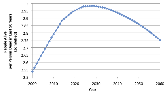
Looking at it this way our odds are much better.  There are currently 2.86 people alive for each person dead in the last 50 years.  On the other hand, our advantage goes away even sooner, due to the stabilization of our CDR.  Here's hoping that the zombie apocalypse is right around the corner?

-----


Wednesday, July 10, 2013

Finding Your Rebalance

In which I use a lot of fancy math to tell you to buy low and sell high.


Aaaaaaand We're Back

So much for sticking to my once-a-week schedule, but thanks for coming back!  I've been thinking about today's post for a long time, but have been too busy to actually model anything until the last couple days.  While I've been teasing with several recent finance posts, this one comes closest to my actual philosophy.  That said...

I am not a financial planner.  You should do your own research and make your own financial decisions based on what is best for you.  Also, I highly recommend making a leveraged buyout offer for Dell Computers.  Everyone I know who has done it is now a billionaire.

Winning!

Anyways, one of the biggest problems with investing is that we don't know the future.  Sure, we can Buy and Hold, but unless someone from the future tells us what to Buy and Hold, we are stuck with our best guesses and a distinct lack of hoverboards.  So we diversify.  By that I mean we make lots of guesses and end up with an average yield.  Most people are of two minds on this.  Their rational risk-averse scared-mammal mind thinks, "Whew, glad I am safe!  And look at all these gains!" while their greedy reward-centered hungry-reptile mind thinks, "Wow, if I had just put a bigger bet on the winners I could have had so much more!"

Well, why don't people put a bigger bet on the winners?  Mainly because, well, most people only have so much money and they don't know the future.  They hedge their bets to mitigate the chance of betting on a loser.  Once you know it is a winner, it is already too late to "Buy Low".

So what if you follow the mantra of "Buy Low, Sell High"?  After all, that is what investing in the markets is all about.  Once your winners are winning, sell high and bet on some potential winners that may go either way.  Rebalancing your assets this way can be dangerous with individual stocks.  If you sell a winner and end up putting all your money on penny stocks that go to zero, your investment hasn't done much for you.  You want assets that are safe and won't go to zero but still show some growth.

One asset that fits the bill is an index fund.  These mutual funds (or exchange traded funds- ETFs) simply follow a basket of stocks (or more recently bonds, real estate, gold, or bitcoins) and reflect the value of the diverse set of underlying assets.  So this is today's challenge: apply the idea of rebalancing to index funds.

A few more notes on index funds.  The oldest ETFs have only been around since the 90's, and most are less than ten years old.  For this analysis I'll only look at the last 10 years of data, and even though I'd love to throw in some alternative assets, the only tradable ones that fit our needs cover things like the NASDAQ (QQQ) and S&P 500 (SPY).  They charge a small fee (~0.05%) to rebalance the stocks inside the fund (not always holding everything, but mimicking the results) and distribute the dividends, but for our purposes we will ignore the slightly different fees and distributions as well as the cost of trading them and tax implications.

Whew!  Let's do some modeling.

An Interesting Start (get it? compound growth? anyone?)

We will start with the NASDAQ and S&P 500 ETFs, which were both assets you could have invested in 10 years ago.  This puts our start date as July 2003, conveniently after the dot-com bust, but far enough back that we should be able to see some divergence.  NASDAQ (QQQ) consists of holdings that are concentrated in the tech sector.  Additionally, it is "market cap weighted" so the bigger companies comprise a larger portion of the assets.  Nearly 20% of it is just Apple and Microsoft, and another 30% is the next 8 largest companies.  Contrast that with S&P 500 (SPY) which consists of holdings spread across more industrial companies.  Yes, they still have Apple and Microsoft, but they also have Exxon, Wells Fargo, General Electric, and Johnson & Johnson.  They are also market cap weighted, but with so many more companies, the top ten don't even make up 20% of the index.  (As an aside, this market cap weighting also means that the ETF only needs to buy or sell stock components when it needs money, as an increase in the price of a company will automatically make it a larger component of the index.  When the ETF does sell assets, selling 0.1% of every company means selling more of the expensive stocks than the cheap ones... already initiating a form of rebalancing!)

So given the information above, which ETF would you have chosen as the best asset for your, say, $10k investment?  The right answer is... you don't know.  Or rather, you didn't know.   You can't predict the future nor should you.  Over that 10 years, the NASDAQ returned 8.2% annually and the S&P 500 returned 5.9%.  If you invested 50:50 in both, you returned just over 7%.


That difference between the two ETFs can be attributed mostly to the growth of two companies: Apple and Google.  While both indices had them, NASDAQ had more.

Oh, how did I make that graph?  You can get the daily close price for QQQ and SPY from July 7, 2003 to July 3, 2013.  This turns out to be over 2500 data points each, which tends to slow down Excel when I try to graph it.  I take the data, crop out the unnecessary bits and sort it in ascending order with:
Column A = Date
Column B = QQQ
Column C = SPY

I then make a Column D which is a series of ascending numbers a fixed number of rows apart.


You can sort by Column D (ascending), and effectively sample your data.  I used every 11 trading days for the graph, but you can easily do every month (21 trading days) or year (252 trading days).  Delete Column D and any excess data, as you won't need it any more.  I also insert three rows at the top to run calculations.  To get the value of each portfolio type the [In Brackets] portion:


Complete the columns and graph.  That 50:50 Buy and Hold portfolio is what we aim to beat.  Hopefully we get up to the yield of the NASDAQ, but without the risk of choosing the wrong asset.

When we rebalance, we are trying to get back to our initial distribution of assets because they have grown at different rates.  This only works if the two data sets are not perfectly correlated with each other.  We can check for this in Excel by looking at our full data set and probing with

Correlation Coefficient [=CORREL(B2:B2530,C2:C2530)] = 0.72

So about 72% of the movement in SPY can be predicted by movement in QQQ, but not all of it.  This makes a lot of sense, as there are several underlying stocks in common between the indices, but not all of them.  Again, this is where some alternative assets would be nice, as they may have even lower correlations.  The other thing you need is for some force other than momentum to be pushing the prices.  It seems silly to add this caveat, but you can imagine that if a stock only went up because it went up the day before, you will never get any benefit from selling that stock to buy one that isn't doing as well.  I don't think this should be a problem.

Stock of the Month Club

As a first pass, lets sample our data monthly (see above) so that we have Date, QQQ, and SPY in Columns A:C with our 50:50 in Column D.  We can have a simple reporter above them that tells us the (geometric) average annual yield over ten years.

Annual Yield of QQQ [=exp(ln((B2533/B5)/10)-1)*100]

Basically you figure out how much growth you have had (final/initial value), spread it over 10 years, and use algebra to find the yield you would need to produce that growth.  For the actual "Monthly Rebalanced" portfolio we will need three columns (E:G).  Each month we will sell all shares, then buy back a balanced portfolio.  (In reality you would only sell the excess shares to buy the lower shares but this is easier to model/explain and gives the same result.)  To do this, put 10000 in cell E5.  Then determine how many shares you will buy using:

(Cell F5) [=E5/2/B5]
(Cell G5) [=E5/2/C5]

We now have equal value in shares of the two ETFs.  Next month we need to sell our shares at that months current price.
(Cell E6) [=F5*B6+G5*C6]

Complete the columns.  (Completing columns F and G down to row 6 first is the easiest way to do this without getting an error.)  Lets check out the results!


Confused?  Yeah, I was too.  It just so happens that you get no benefit at all.  But this should work?!?  I'm supposed to make fun of other people's silly financial strategies not disprove my own! 

One way to wrap your head around this is that when we model the Monthly Rebalance method, we aren't doing it smartly.  We really don't know why we rebalance or even if it's necessary.  We could have a completely balanced set of assets that we sell and buy back in the exact same ratio.  Alternatively, we might be missing out on huge imbalances simply because it isn't time to change yet.  When it is time to change, the imbalances may have resolved themselves.  All this means is that the small amount of momentum inherent in the price swings can eat away at our inept rebalancing attempts.  There are two solutions to this.  We can rebalance smarter or more often.

If At First You Don't Succeed, Repeat As Necessary

Lets try more often!  Bring back the full set of data with date, QQQ (daily), and SPY (daily) in Columns A:C.  Make a 50:50 portfolio in Column D as well.  Now apply the same E:G equations and complete the columns.  This is modeling what would happen if we sold everything at the end of the day and immediately bough back a balanced portfolio.  Lets check the results... again!


Now thats what I'm talking about!  Now we were able to take advantage of all the imbalances brought on by the volatile market.  An extra 0.7% yield is nothing to sneeze at, and all it costed us was... wait (doing maths in head cheap $5 trades, selling all of two ETFs, buying back two ETFs, each of 252 trading days a year... $5*(2+2)*252 = ) a little over $5k a year... to handle our $10k portfolio.  Ouch.  Granted it would still be $5k for a $10mm portfolio (0.05%), but I don't have ten million dollars.

I Can't Believe It's Not Smart Balance

So what if we instead rebalanced smarter.  Only when we needed to.  Only when things were really out of whack.  First, lets define really out of whack.

Out of whack = (Cell A1) = 0.05

So "out of whack" currently is set at 5%.  We'll be changing this later on.  I'll just add this Smart Rebalance to our Daily Rebalance worksheet.  Start out the same way:

(Cell H5) [=10000]
(Cell I5) [=H5/2/B5]
(Cell J5) [=H5/2/C5]
(Cell H6) [=I5*B6+J5*C6]

So you start with the same shares.  Now we throw in some IF statements:

(Cell I6) [=IF(ABS((I5*B6-J5*C6)/H6)>A$1,H6/2/B6,I5)]
(Cell J6) [=IF(ABS((I5*B6-J5*C6)/H6)>A$1,H6/2/C6,J5)]

So now if the difference in our two assets is more than 5% of our portfolio, we rebalance to 50:50, otherwise we keep the shares we have.  Complete the columns.  And the results?


Not too bad!  How much did it cost us?  Well, we can make a quick reporter:

(Cell K5) [=SUM(K6:K2533)]
(Cell K6) [=IF(J6=J5," ",1)

This returns 1 each time we rebalance, then adds them up.  For the 5% threshold, we end up with an average of 1.7 trades per year (doing math again... man I should really get a computer program that can do this instead $5*1.7*(2 sells + 2 buys) =) about $34 a year to manage our portfolio and squeeze another 0.15% out.  Again, this doesn't really help a $10k portfolio (since it only squeezes out $15), but right around a $23k portfolio it does pay off.  Additionally, many brokerage firms give you a few free trades a year or free trades on ETFs if you hold them for more than a month.  Also, if we really just sold our overperformer and bought the underperformer, that cuts our costs in half.  Anyways, you probably noticed by now that the Smart Rebalancing didn't quite get back to the Daily Rebalancing.  This changes if you change your stringency threshold.


As you can see, moving to the 2% range can squeeze out nearly 0.5% extra yield and still stay near one rebalance a month.  Unlike our previous Monthly Rebalance, these Smart Rebalances are distributed over the ten years as necessary.


Though you can't tell it just from this graph (as rebalancing can go either way), NASDAQ fared much better during the '08 collapse (once again, due to Apple and Google being more heavily weighted).  Benefiting from one fund's awesome stretch is what rebalancing does best.

Foreign vs. 'Merican

But as I mentioned before, NASDAQ and S&P 500 have a lot of correlation.  Lets look at some other ETFs that have ten years of data.  I won't bore you with the Excel details- basically I imported the data the same way and ran [=CORREL(B5:B2533,C5:C2533)] on each relationship.


As you can see, most index funds of stocks (name on the side, ETF ticker symbol on top) have significant correlation.  (As an aside, you can see why the only good use for the Dow Jones is that it predicts movement in the S&P 500.  If only we had an indicator for that... such as the S&P 500.) One nice low correlation pairing is the Consumer Discretionary Fund (XLY) which features stocks like Home Depot and Ford, with the Emerging Market Fund (EEM) featuring stocks like Samsung and China Mobile. 


As before, a 50:50 mix gives an average yield between the two individual ETFs that can be significantly improved by Daily Rebalancing.  Interestingly, it takes very little Smart Rebalancing to achieve similar results.  This may be because both these funds are more volatile than the ones we were looking at previously, but the end result is that you can set your threshold high and end up trading only once or twice a year.  This meant that when EEM reached new highs at the beginning of the year, a 10% threshold allowed you to sell (maybe missing the true peak) so that you would instead be invested in XLY when EEM came crashing down in June.

One, Two... Many

Realistically, it is unlikely that you are invested in just two ETFs that you have to balance.  In a way that makes things easier.  Now we are just looking for the huge imbalances where one component is, you guessed it, way out of whack.  Lets try it with all four ETFs.

The 50:50 portfolio and Daily Rebalance portfolio are pretty much the same.  Just change any "/2" to "/4" and you are basically there.  (I guess that technically makes it a 25:25:25:25 portfolio.)  For the Smart Rebalance I'm going to need to get a bit tricky.  Fill in Columns A:E with the date and the four different datasets.  Column F will be our portfolio size, and we will still make F5 [=10000], but instead of implicitly valuing each component, lets make Columns G:J be the value of our four assets.  Initially we can assign G5:J5 [=2500].  Now we need to determine how many shares we have to start and insert them in Columns K:N similar to before:

(Cell K5) [=G5/B5]
(Cell L5) [=H5/C5]
(Cell M5) [=I5/D5]
(Cell N5) [=J5/E5]

The value of the share the next day contributes to the total portfolio:

(Cell F6) [=sum(G6:J6)]
(Cell G6) [=K5*B6]
(Cell H6) [=L5*C6]
(Cell I6) [=M5*D6]
(Cell J6) [=N5*E6]

Now for the IF statement.  We will rebalance only if the difference between the most valuable and least valuable components is more than (A1= out of whack) percent of the portfolio:

(Cell K6) [=IF((MAX(G6:J6)-MIN(G6:J6))/(F6)>A$1,(F6/4/B6),K5)]
(Cell L6) [=IF((MAX(G6:J6)-MIN(G6:J6))/(F6)>A$1,(F6/4/C6),L5)]
(Cell M6) [=IF((MAX(G6:J6)-MIN(G6:J6))/(F6)>A$1,(F6/4/D6),M5)]
(Cell N6) [=IF((MAX(G6:J6)-MIN(G6:J6))/(F6)>A$1,(F6/4/E6),N5)]

Complete the columns!  Lets look at different thresholds:


Now we're talking!  With a 3% threshold, trading just 5 times a year you can beat three of the four components of your portfolio.  While you don't get the huge results of your best ETF, your transaction costs are very reasonable to squeeze out a 0.5% increase over a simple Buy and Hold.  In reality, you aren't going to have an alarm going off when your portfolio starts to go out of whack.  You aren't going to have this exact schedule:


Hopefully you just keep an eye on things.  Hopefully you aren't paying someone else 1% of your portfolio just so they can "beat the market" by 0.5% doing what you could do in 5 minutes every two months.  Over the last 10 years it seems like you could invest quite well just by diversifying and rebalancing.  Just remember, past events may or may not be indicative of future ones.

-----

So apparently Blogger (read: Google Overloards) now allows people to actually subscribe to blogs!  It feels so 2008!  The google groups email list is still active, but if you want to subscribe to the blog now I'd suggest using the link on the right panel.